Context & Role
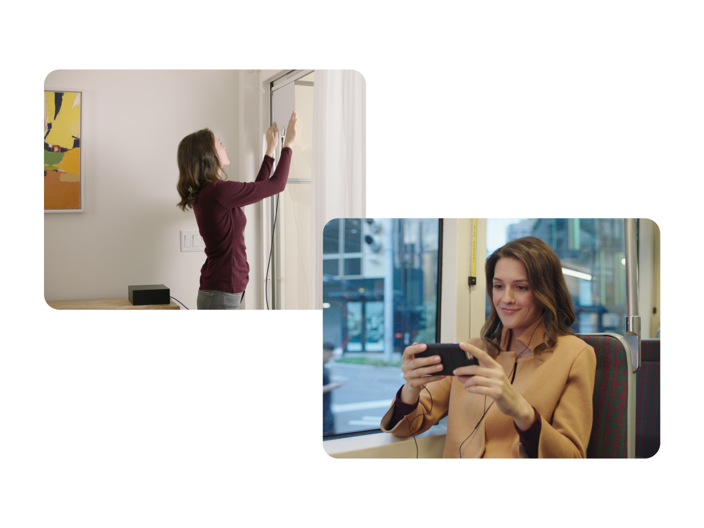
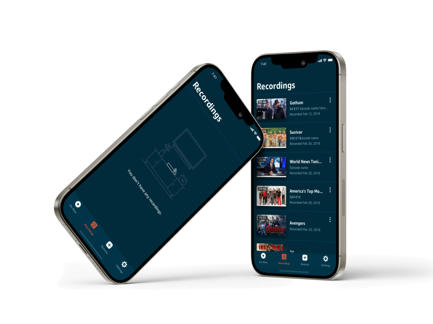
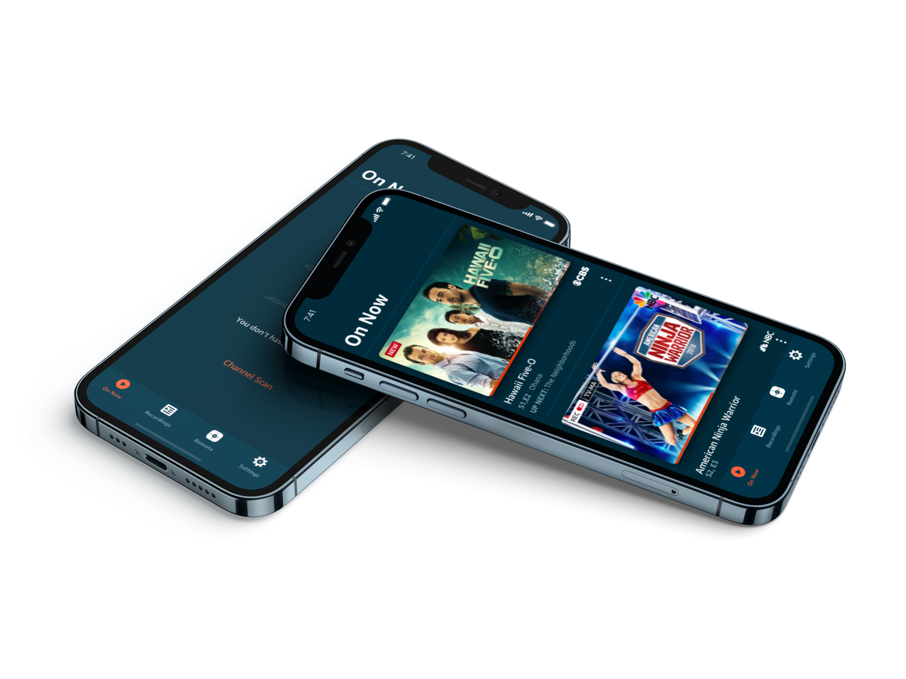
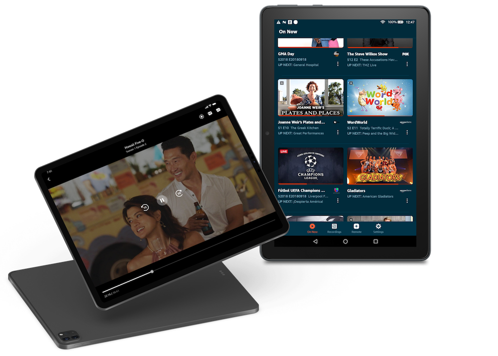
The FireTV App has evolved beyond its origins as a simple virtual remote. The new version enhances the FireTV experience by allowing customers to access live TV channels and recorded content anytime, anywhere, on their phones or tablets.
The biggest challenge was to design a product that needed to feel native across Android and iOS while remaining consistent as a single Fire TV experience.
Supporting Android and iOS meant balancing platform-specific expectations with product consistency. Supporting both phones and tablets introduced another layer of complexity, requiring layouts and interactions that could scale across significantly different screen sizes.
I joined this program in 2017 and led the design system and design integration efforts. Working closely with both the iOS and Android engineering teams, I crafted a robust design library with development-ready technical specs that worked for both engineering stacks. This collaborative effort brought a successful launch in 2018.
Challenges & Solutions
01 /
Balancing Native Expectations with Product Consistency
To support both Android and iOS natively, I focused on identifying reusable patterns that could adapt while preserving a cohesive user experience.
I approached this challenge by investigating platform guidelines, adapting designs to platform UI standards, and aligning patterns with engineering best practices.
Later on, I realized that designing for both Android and iOS required more than applying platform guidelines.
Some interactions benefited from following native conventions because they aligned with user expectations. Other experiences needed to remain consistent across platforms to preserve the Fire TV product model.
The challenge was determining where consistency created value and where platform adaptation improved usability.
By delivering the design system with brand-focusing patterns, platform-specific components, and development-ready specs, I ensured feature compatibility, feasibility, and cohesiveness across iOS and Android.
02 /
Defining Adaptive Layouts to Enable Scaling Across Phone and Tablet
iOS and Android both run on a variety of devices that have different screen sizes and pixel densities. Instead of treating phones and tablets as separate products, I focused on creating scalable patterns that could adapt to different size classes, while preserving hierarchy, usability, and implementation efficiency.
By identifying flexible structures rather than device-specific solutions, I delivered the design system with flexible components, adaptive layouts, and stretchable assets to ensure scalability across diverse devices.
For a detailed case study walkthrough, please reach out.